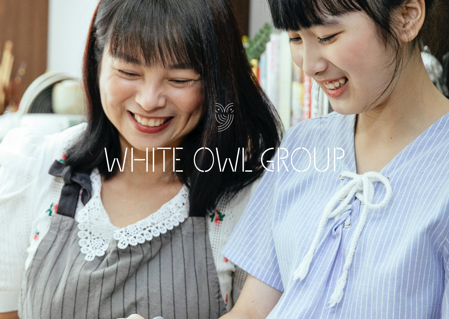
Reimagining sustainability and wellness in a people-first, forward-looking approach
Challenge
White Owl Group, led by an industry leader in the Health and Wellness sector, is facing the problem of lacking a cohesive brand identity that aligns with its visionary mission.
As the founder's businesses continue to grow, it became essential to establish a new entity, White Owl Group, to consolidate all existing Food & Beverage companies under one umbrella.
The group's mission is centered around creating innovative and stylish wellness and sustainability concepts, symbolizing transformation and providing superior solutions to consumers.
Solution
White Owl Group is all about reimagining sustainability and wellness with a people-first approach and a forward-looking mindset. The brand strategy is focused on creating a wellness experience that revolves around people and their needs. It is all about making a positive impact on individuals, communities, and the planet.
White Owl Group’s approach to sustainability is inclusive and adaptable. They believe that sustainability is a team effort, and everyone can contribute, regardless of their dietary choices.
We positioned the brand as a leader in the industry, with a strong emphasis on making the earth a better place for people to live in.
The end result is a brand that is not only friendly and approachable but also forward-looking, reflecting on their commitment to providing innovative solutions for a balanced and fulfilling life, for everyone to play a part in sustainability.
Design
For the design approach, we have chosen a modern minimalistic style that reflects the commitment to sustainability. The group strives to keep things clean and simple while also infusing a sense of freshness and innovation.
By combining the principles of minimalism with a forward-thinking mindset, we aim to create designs that are both timeless and cutting-edge, showcasing their dedication to sustainable practices in a contemporary and innovative way.
Logomark
After extensive exploration and refinement, we created a minimalistic abstract owl that positions them as a forward-looking brand by embracing clean lines.
The curved clean lines of the minimalistic abstract owl represent their commitment to a sustainable and minimal approach, while also inspiring innovative solutions.
Wordmark
Complementing the owl logomark is the distinctive logo wordmark.
Designed with connecting lines, it symbolizes the connection between individuals and their journey towards sustainability and wellness.
The interconnected lines evoke a sense of unity, collaboration, and the power of collective action.
Typography
The header text features a sans serif font with distinctive edges, while the body text uses a clean sans serif font.
These typography choices reflect the brand's emphasis on a clean and refined aesthetic, aligned with its core focus on sustainability.
When it comes to colour, White Owl Group breaks away from traditional neutrals and beiges. Instead, we have carefully curated a colour palette featuring soothing blues, light greys, and monochromatic shades.
This colour selection reflects the brand's elevated status and modern approach. The blues evoke a sense of tranquility and reliability, while the light greys and monochromes add sophistication to the overall visual identity.
Colour Palette


